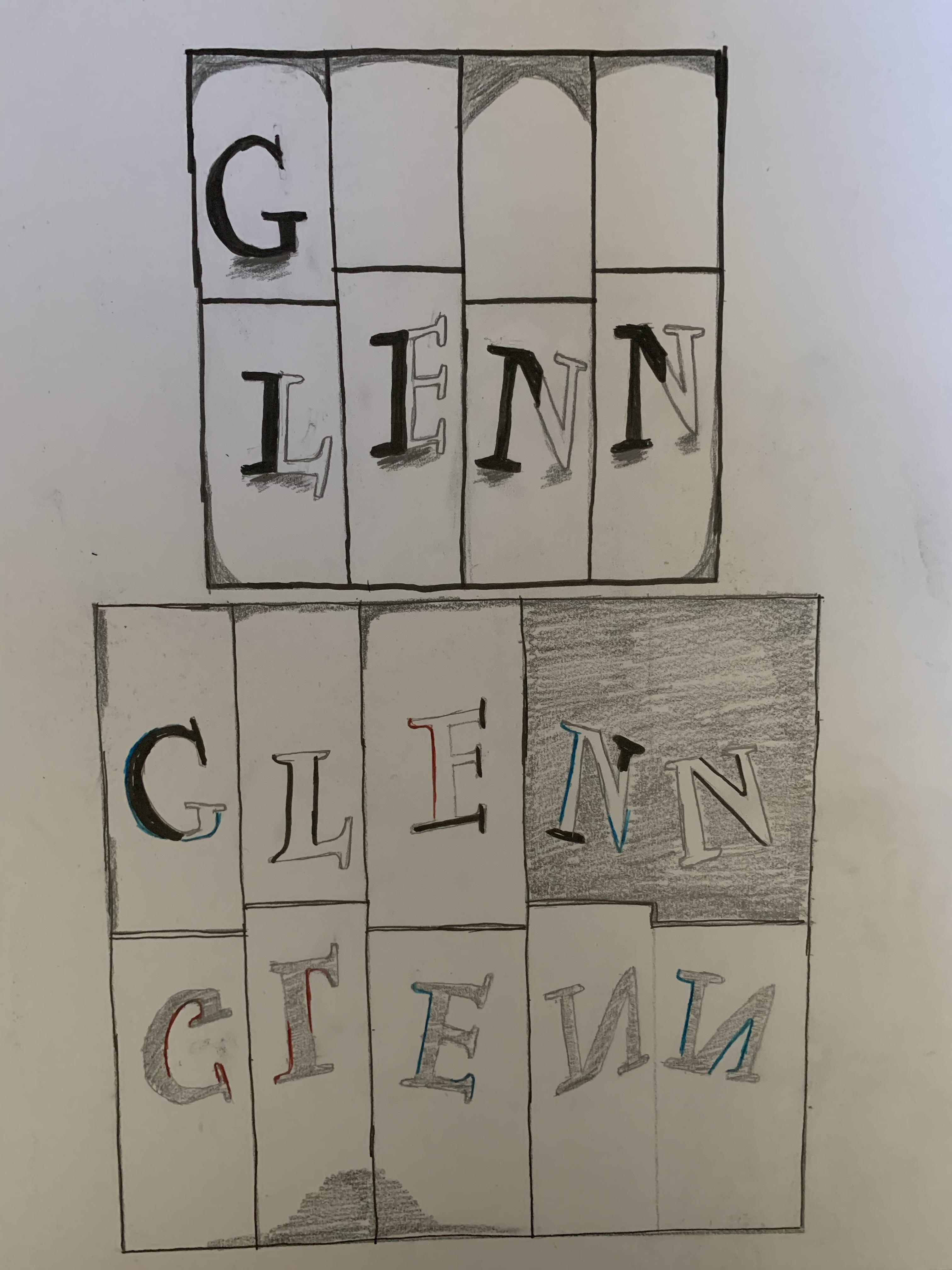
Here are my 6 Line Shape Drawings with color, coloring really was the fun part by trying to find colors that matched well
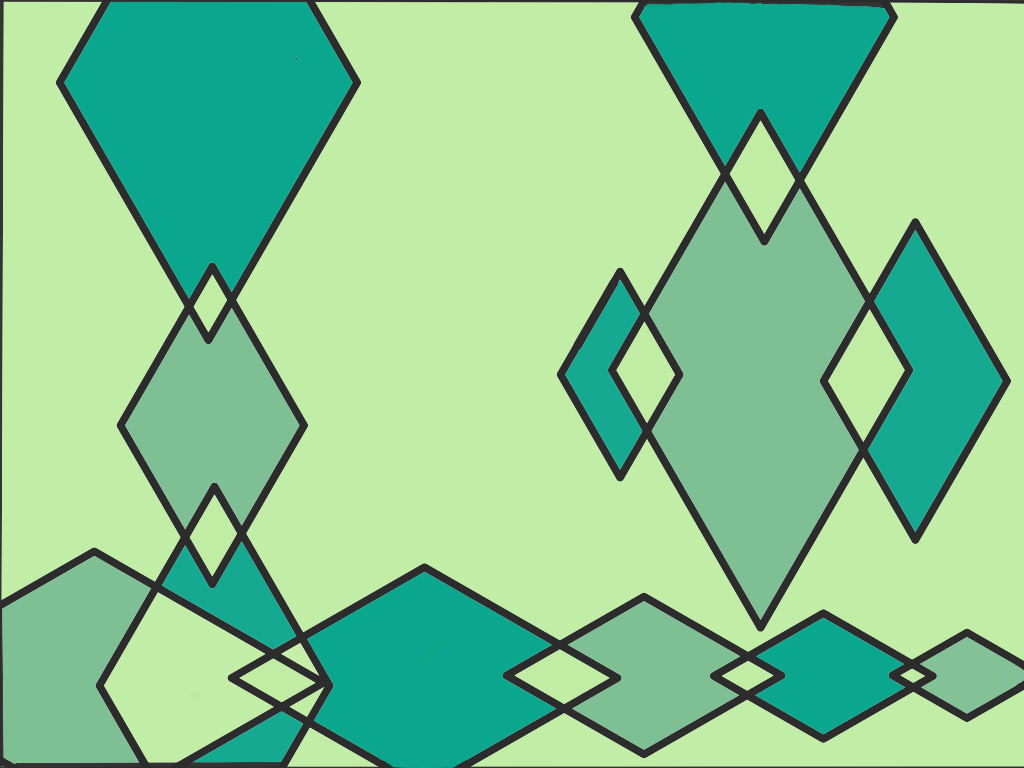
Analogous (Green, Light Green, Dark Green) 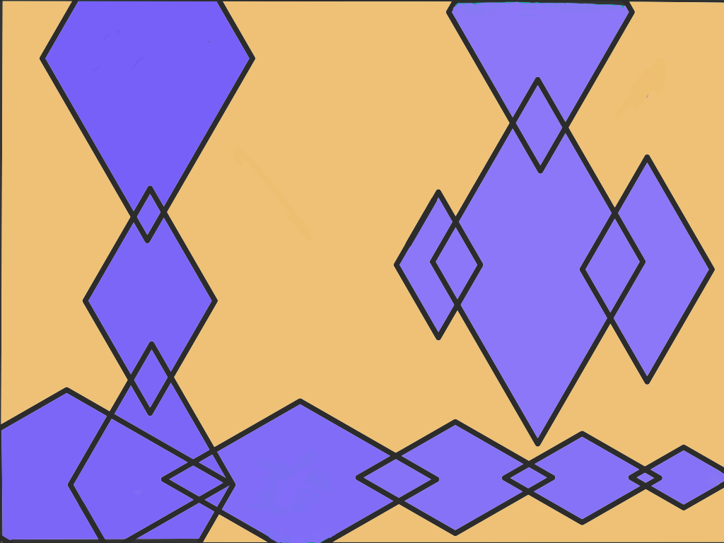
Complements (Purple, Orange 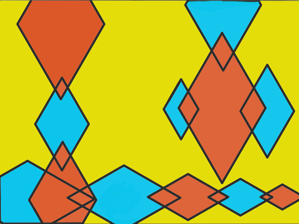
Split Complements (Yellow, Orange, Blue 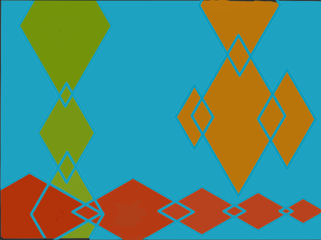
Tetrad (Green, Blue, Red Orange) 
Triad (Red,Blue, Yellow) 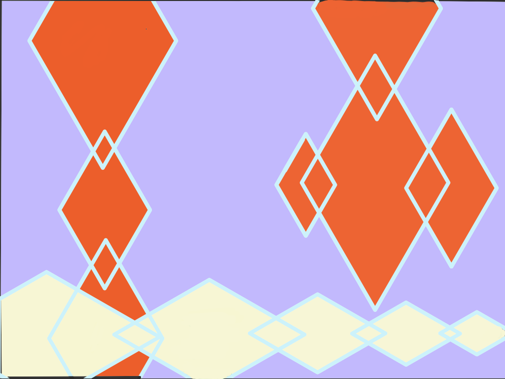
Double Split Complements (All are Light colors of Purple, Orange, Yellow, and Blue